Background (From Toboggan)
The origin of our name isn’t just a trendy ode to Canadiana. It is a tip of the toque to our Forest City heritage, which was a tobogganing mecca in the late 1800’s. Toboggan clubs sprang up all over the city and soon the sport solidified into a citywide spectacle catching the eye of visitors such as famed author Mark Twain.
Massive wooden ramps were built all over London including sites at Wolesley Barracks, Western University, along the hames River near Ann St., which was the location of the original Carling Brewery, and as well beside the original and current Labatt Brewery. The most impressive ramp was a 485 foot long double chute, located across Victoria Park from us at Wellington and Central.
It’s in the spirit of tobogganing, where people from London come together to have fun. We bring you the Toboggan Brewing Company– locally crafted beer.
Original Identity
The previous Toboggan identity was both clean and slick. It appeared to fit in the craft brewery market fairly well. However, this beautiful logo also has several flaws– when scaled down it loses some of the finer details making it harder to recognize. In addition, the underlines beneath the ‘o’s have no real purpose. Rather than placing them for no apparent reason, they can make a cleaner logo that is more readable.

Initial Concepts
Toboggan Brewing Co. is based in London, ON, which houses two of the biggest party schools in Canada. Western University is just down the street from Toboggan and Fanshawe College a short bus ride. Currently, Toboggan doesn’t do enough to capitalize on these young students. The main idea behind these concepts was to make the brand identity more playful. This would attract a younger audience, hence the round shapes.

Finalized Logos
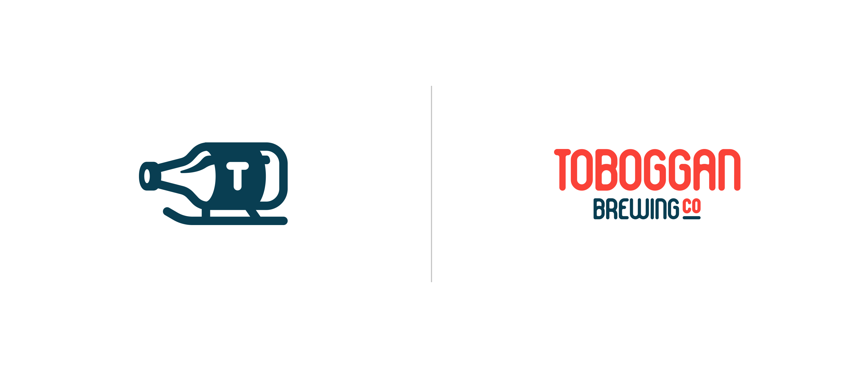
On the left is the refreshed Toboggan logomark. It displays playfulness while incorporating the company’s rich heritage. At first glance you can instantly tell the mark revolves around the beer industry. On the right is the custom wordmark. The typography came from a tweaked version of Vääksy Round, a typeface created by myself. This typeface aligned with the round edges of the Toboggan mark while keeping it professional.
Promotional Material
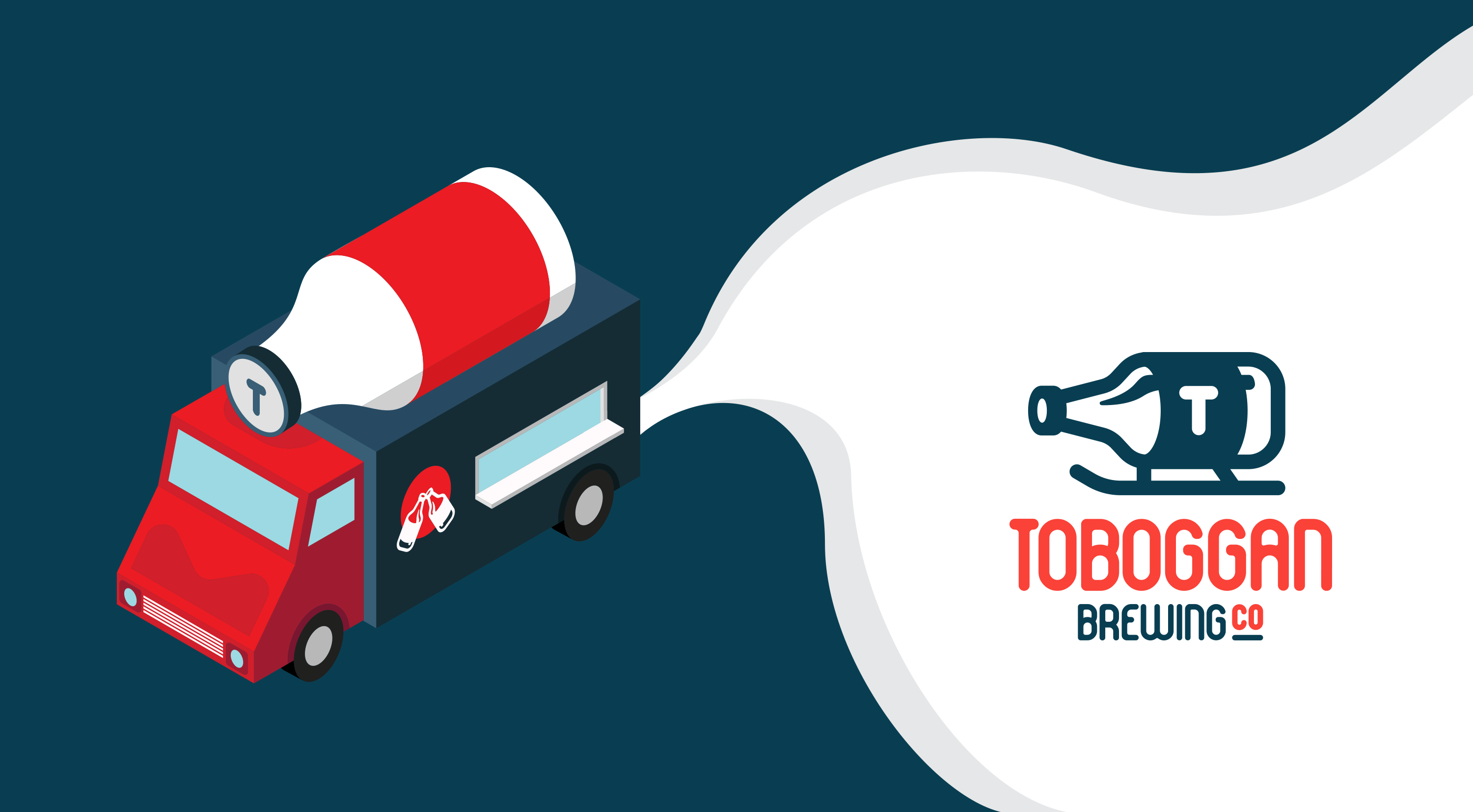
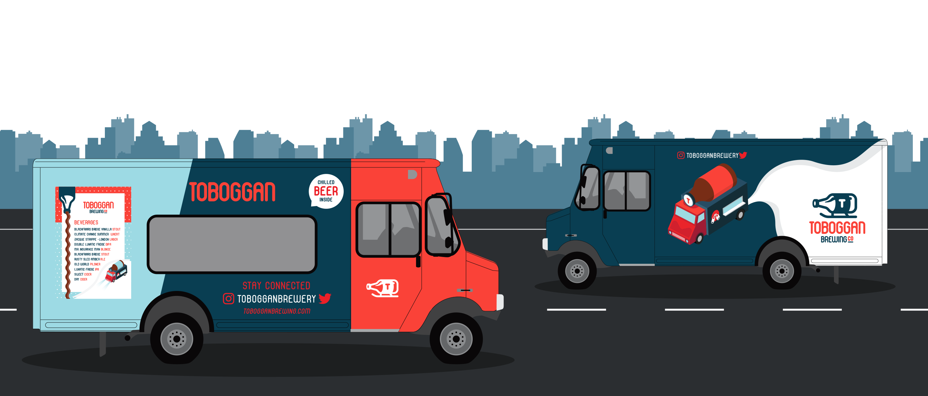
In addition to the identity, I had the opportunity to create multiple designs for a “drink truck”. The drink truck would be located at beer festivals, special events, etc. This truck would have a custom wrap around the whole vehicle as well as custom menus for the customers.
Seasonal Advertisement
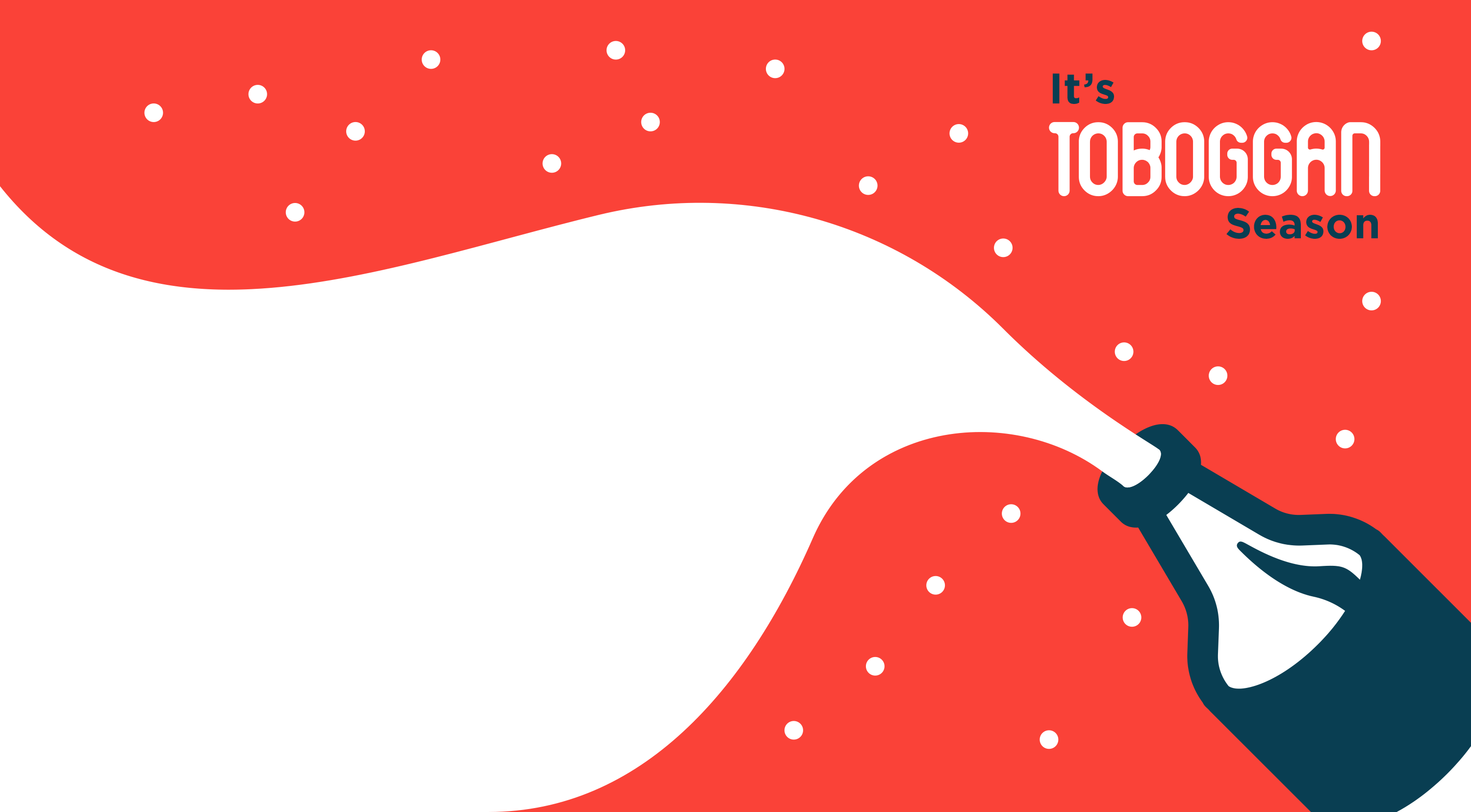
These illustration ads are to run during the holiday season, hence the snow. The idea is to connect family time and Toboggan Brewing Company. Where you can enjoy plenty of family dining fun and pints of your favourite beers.

