Problem:
Argyle Mall in London, ON is looking for a promotional campaign to attract more traffic to their mall.
Solution:
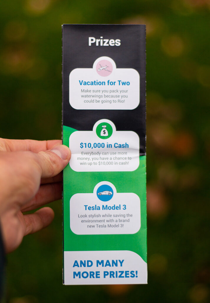
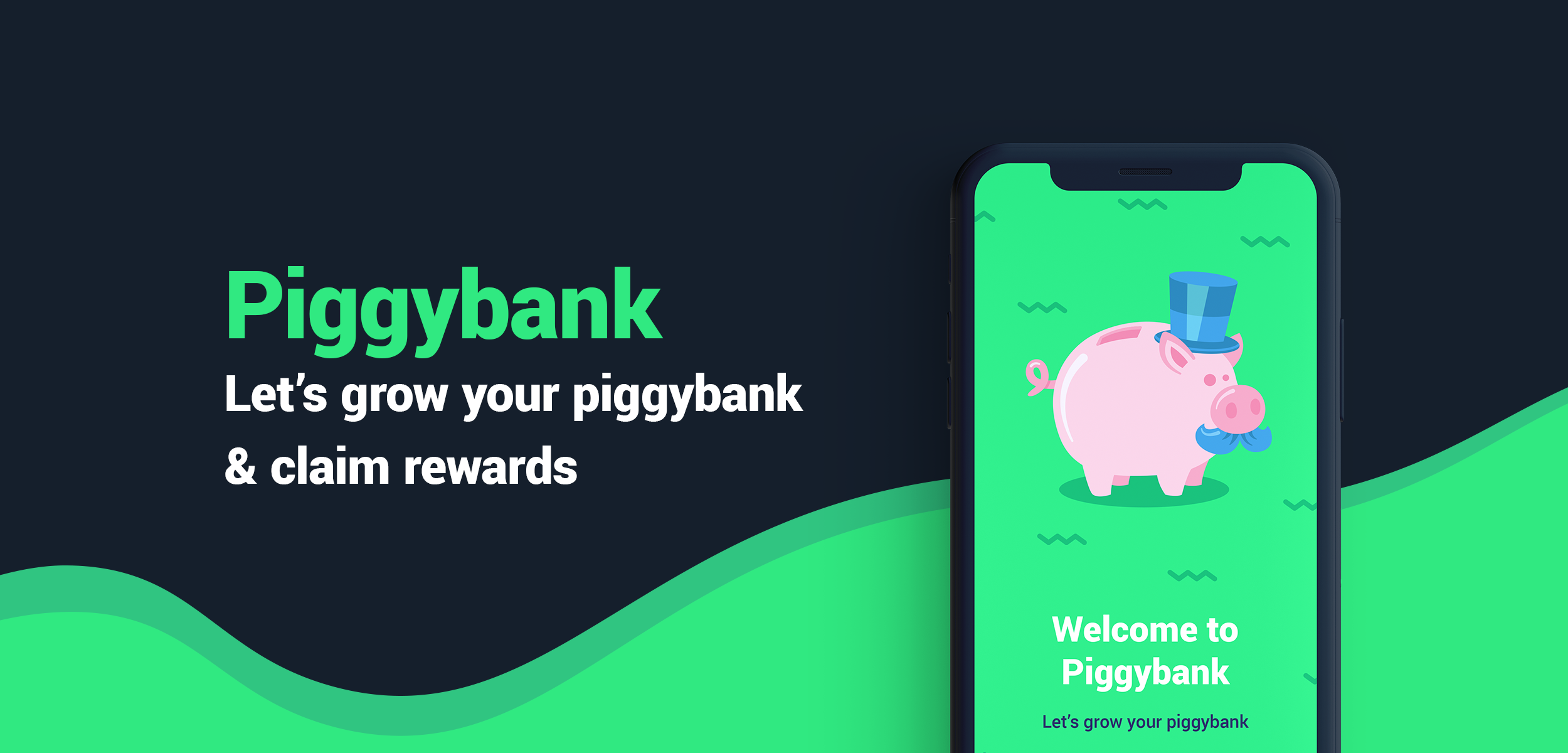
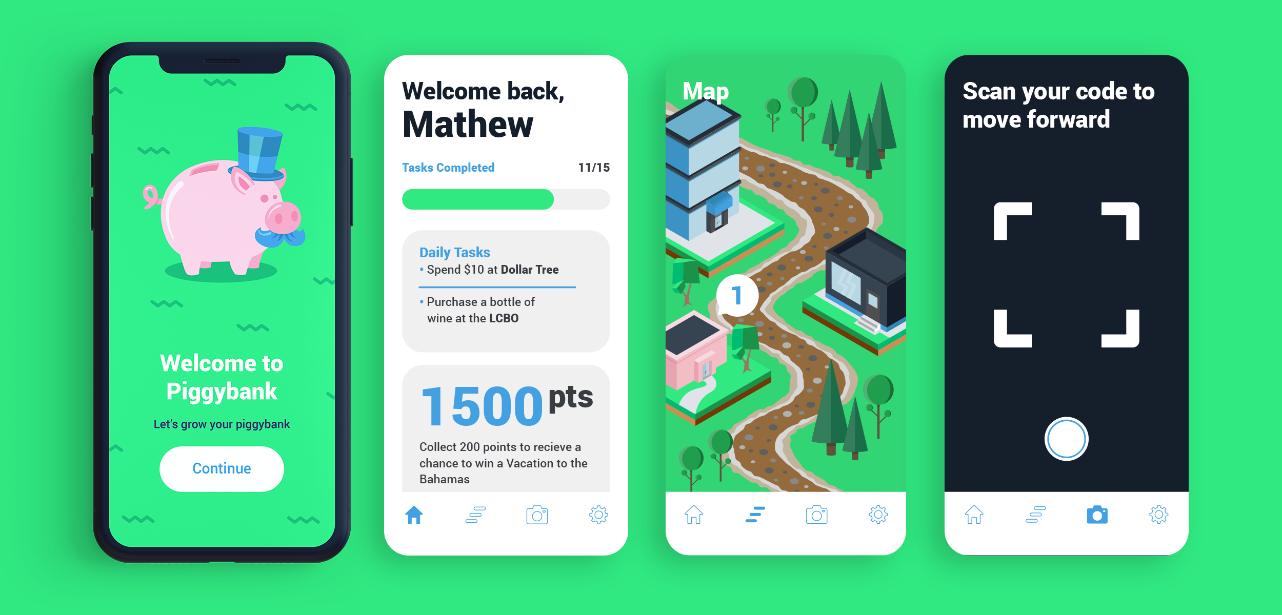
Piggybank is both a digital and physical companion for your shopping. Complete daily challenges to receive Piggybank stickers! Just ask your cashier for a Piggybank sticker when you have completed a daily challenge. When you complete all the levels in each and every world you instantly earn a gift Argyle Mall gift card! The more challenges you complete, the more chances there are to win!
UI/UX:
Piggybank’s user interface was designed carefully with attention to human interaction patterns. The menu dock was placed at the bottom of the screen as it is the easiest and quickest spot to access for users, making navigation swift throughout the application. The interface is clean, with very few distractions. This allows all audiences, regardless of age, to have a seamless experience within the app.
Web Design:
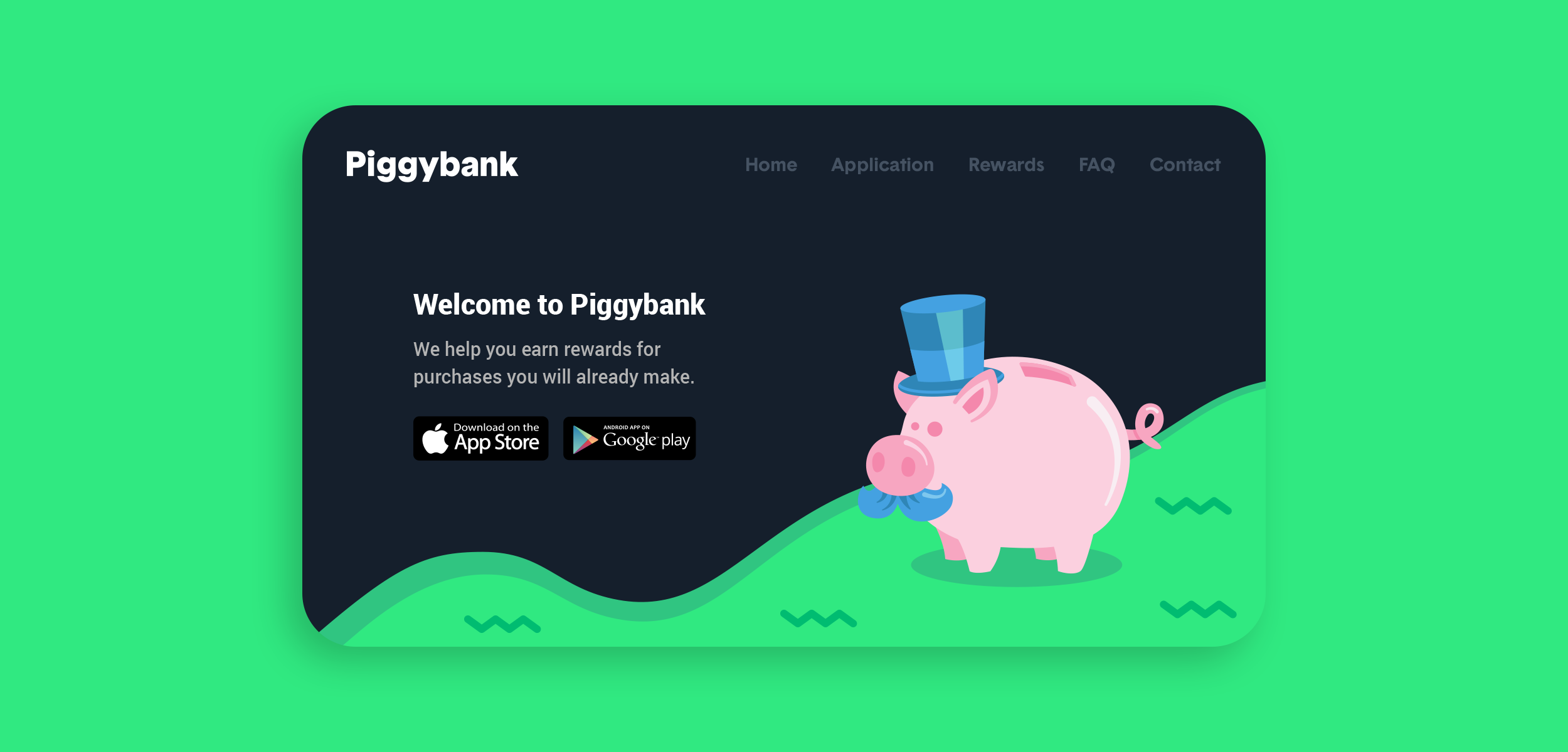
In addition to the design of the application, the website also plays a large role in the promotional campaign. The main highlight of the landing page is the call to action– downloading the Piggybank Application.
Map & Building Design:
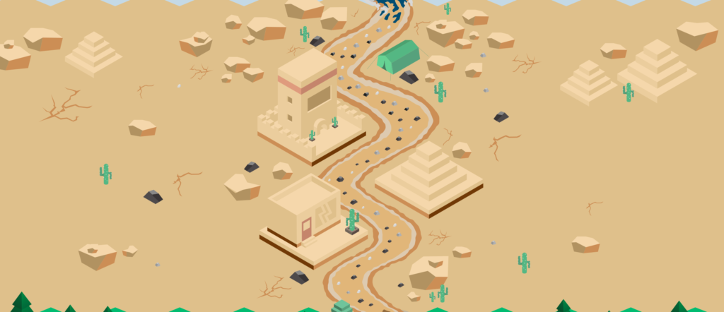
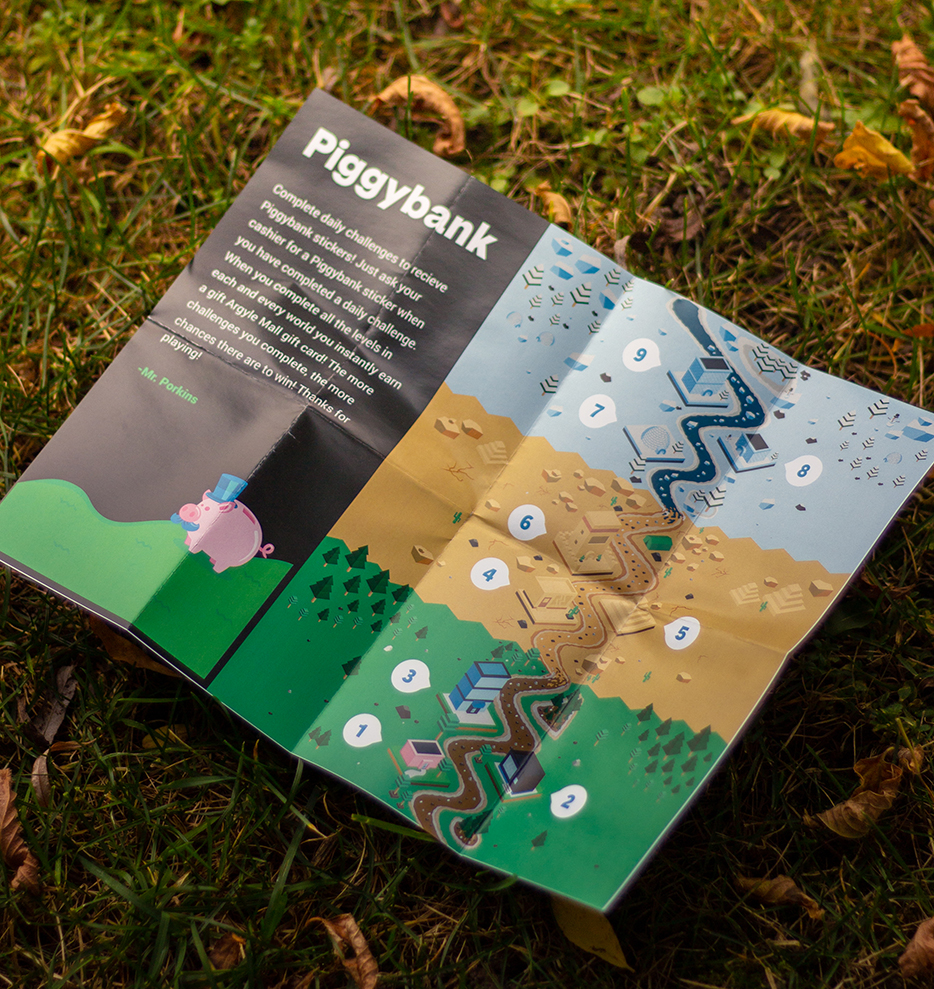
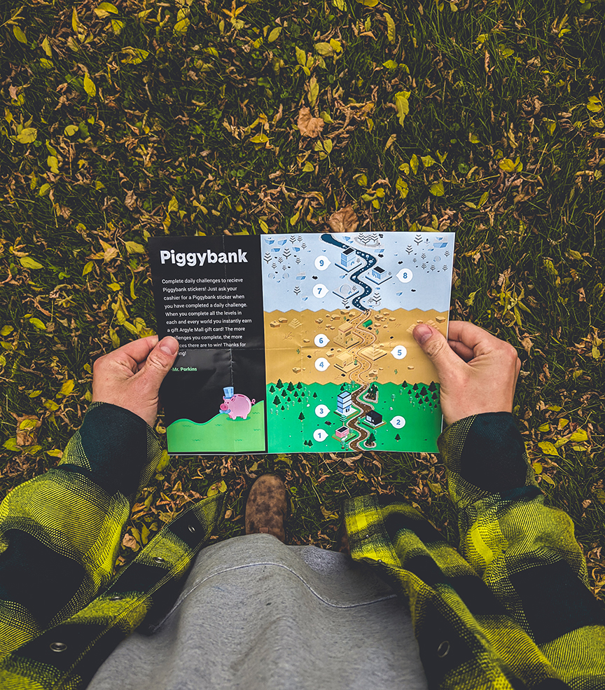
Piggybank uses an isometric grid to create all the building designs incorporated in the map. The map features several worlds with different environments: grass, desert, and winter landscapes.
Printed Map:
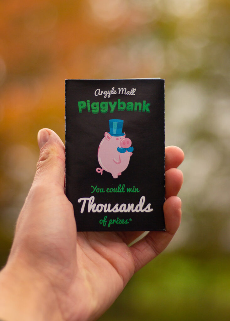
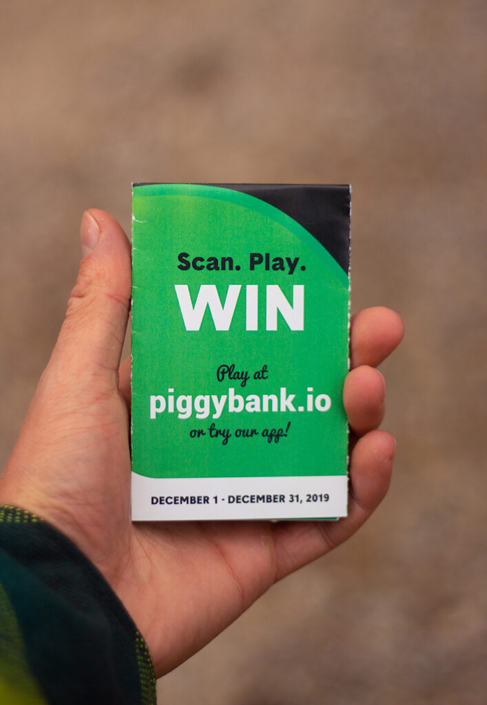
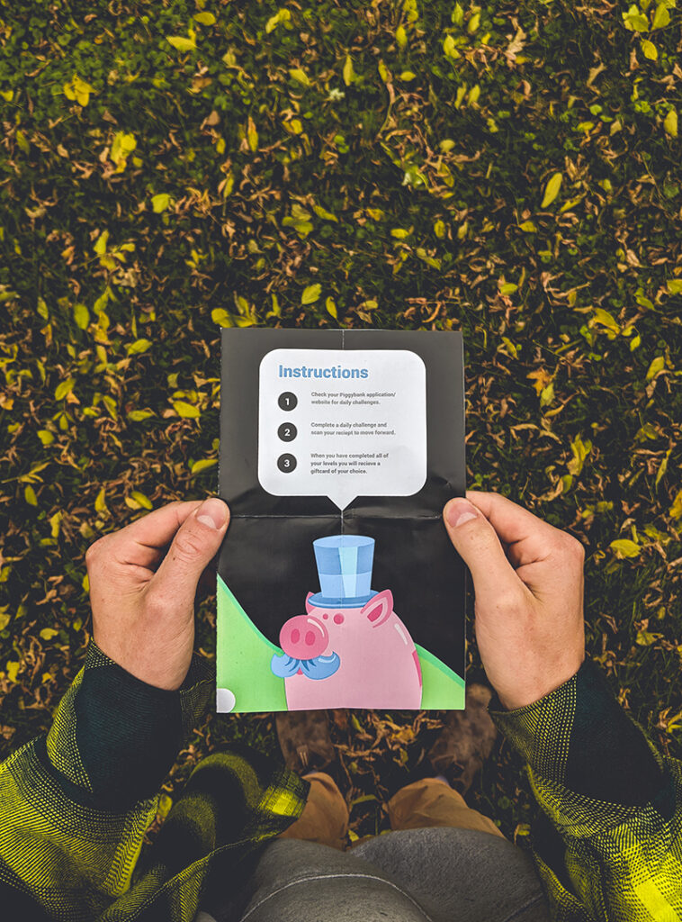
Not only is the map displayed on the Piggybank app, there is also a print version for people to use in store. They collect special Piggybank stickers when completing their tasks.


