About
Plantscaping is a fictional landscaping company based out of London, ON. They offer a variety of services in both hardscaping and soft-scaping.
Identity
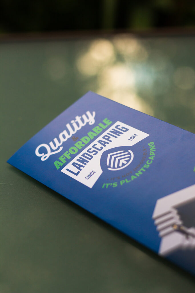
Plantscaping’s identity can easily be linked to two core values: Plants & Landscaping. Since the business revolves around these values it is imperative to include them in the logomark. The tree represents the plant side of landscaping– catering to the beautiful trees and bushes used in jobs. The upside down arch refers to the landscape side of things– terraforming earth to create something the client desires. The logomark follows a simple grid made up of circles and lines. This mark works well for the field of landscaping as it is classy, interesting, and professional. All elements most landscaping companies lack with their branding.

Goal
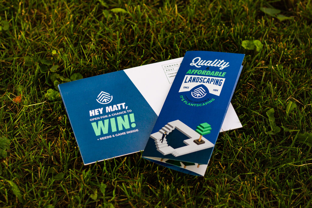
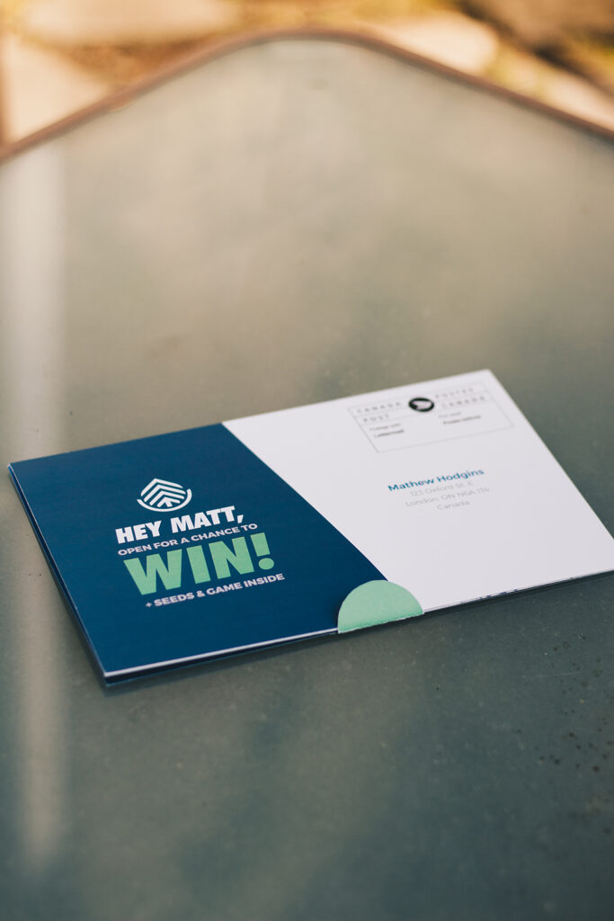
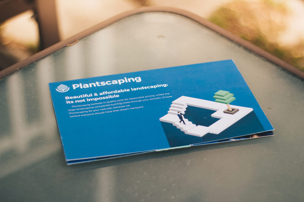
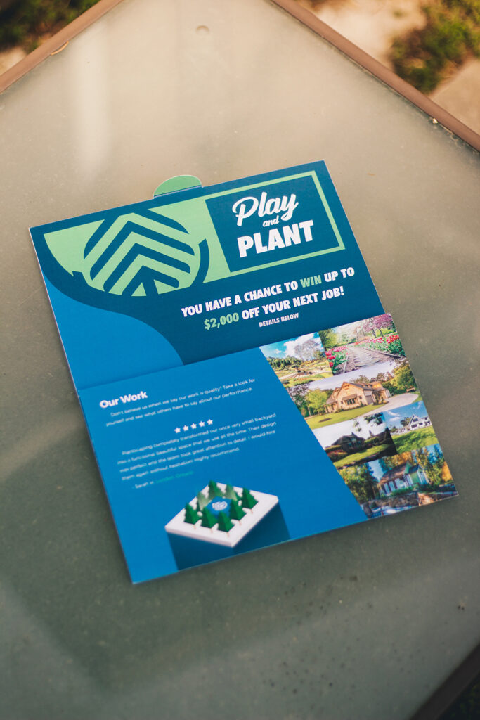
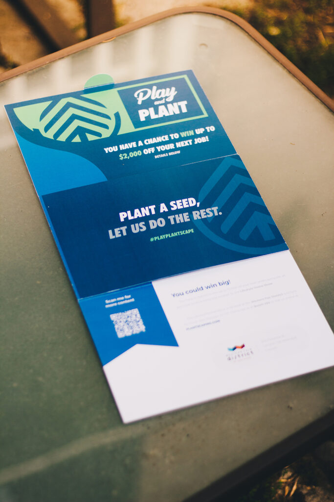
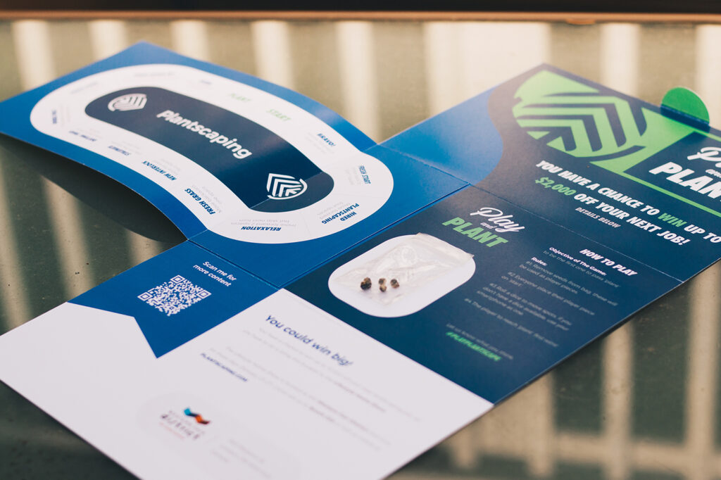
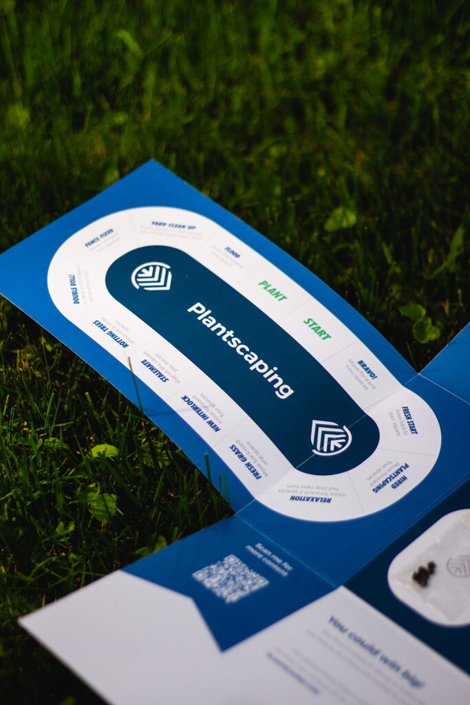
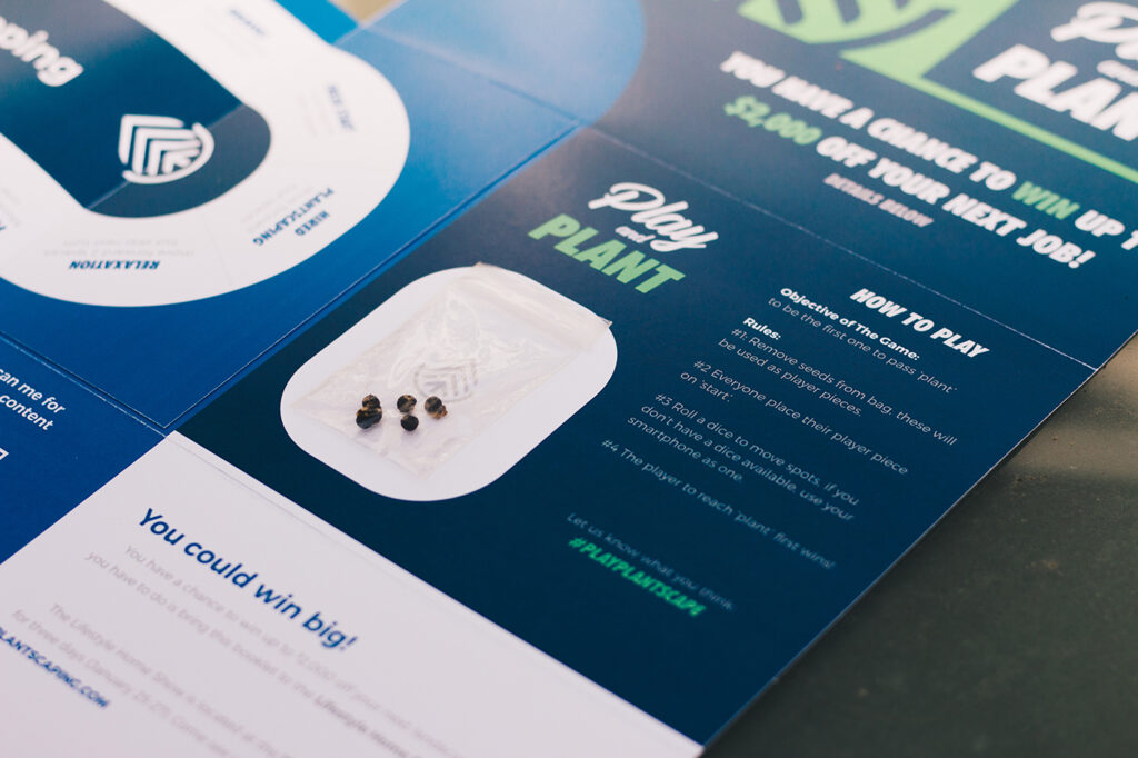
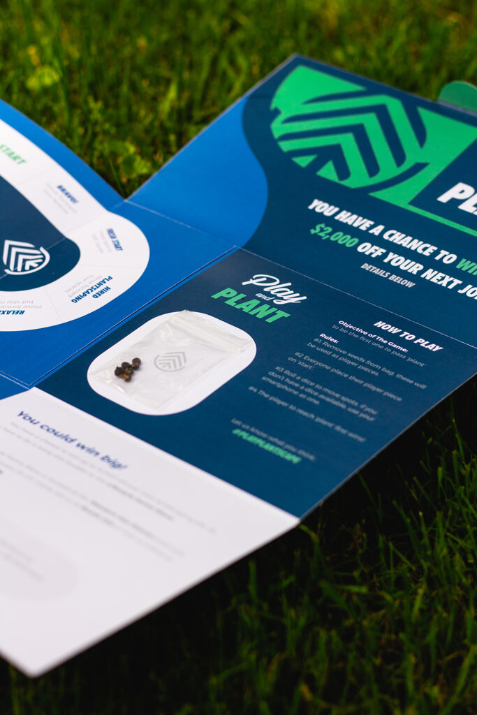
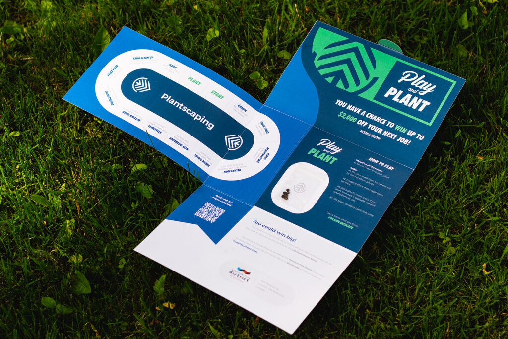
The client was looking for a direct mail design to direct individuals to a home renovation show. Many direct mailers never see the light of day as the receiver throws it out very quickly. I chose to take a creative approach in hopes that the mailer would stick around longer. With that in mind, I created a compact pamphlet that folds out into a board game. This would increase the chances of individuals going to the home show (and gain them as clients). As long as the users play the board game, it has a lower chance of being trashed. Tree seeds act as game pieces and accompany the mailer. Once players are completed the game, the seeds can be planted. further tying into both the brand name and landscaping theme.
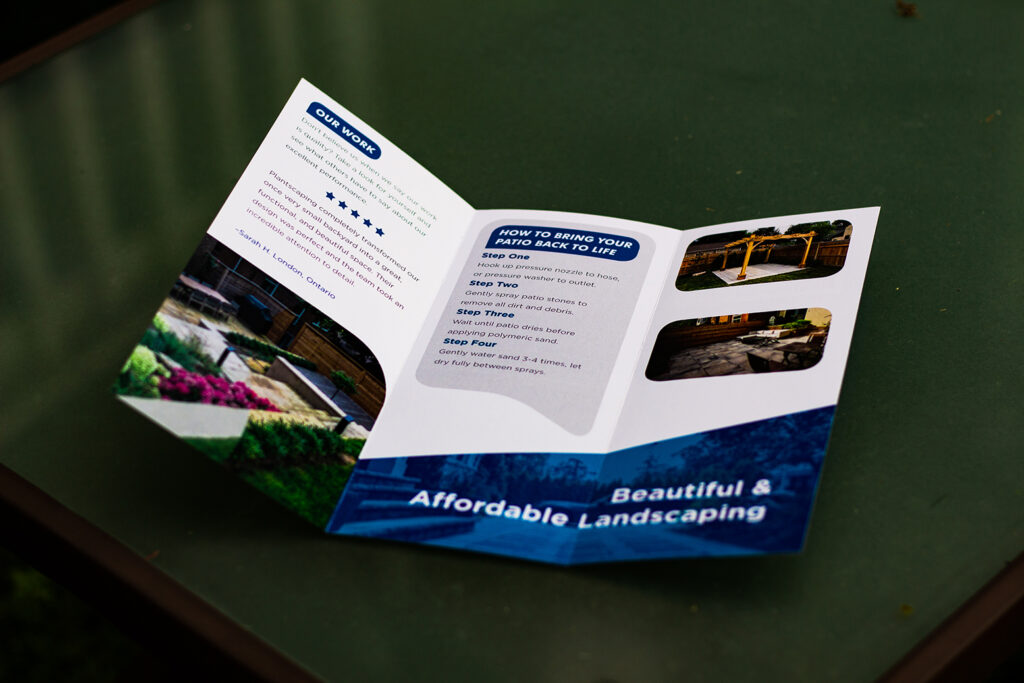
Brochure
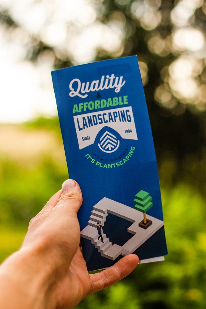
In addition to the direct mail piece, Plantscaping was also looking for a brochure. The printed brochure would showcase work, testimonials, and warranty information. This is an alternative promotional piece to the direct mail but works very similarly.
